
May 2018
Benchmark Risk and Portfolio Analytics
This paper demonstrates the role of bank-sourced benchmarks and indices in credit portfolio management (“CPM”). All banks aim for optimal risk-adjusted returns across their book of business, but there is an increasing focus on credit portfolio diversification in comparison with their competitors. Bank-sourced data provides benchmarks that measure this diversification and allow banks to make better-informed portfolio construction decisions. This paper presents a number of benchmark risk and portfolio analytics worked examples based on current IRB bank use cases.
Download the PDF “Benchmark Risk and Portfolio Analytics”
IACPM regularly publishes updates and survey results on CPM Principles and Practices. These typically cover:
Banks implement these in different ways depending on their size and business mix, but there is enough overlap in CPM practices across banks to support development of meaningful bank-sourced peer group benchmarks. This paper makes extensive use of these.
The portfolio approach to risk diversification was developed in the 1950s for traded equities, and it is now ubiquitous amongst asset managers. Application to credit exposures has been more challenging. Some of the major issues – asymmetries in credit pay-offs and loan duration, legal idiosyncrasies in individual loans, limited secondary liquidity and a lack of suitable hedging instruments – have been addressed (e.g. by Bohn and Stein * ). But Randy Miller, former IACPM treasurer, has shown that some asset management concepts, especially in performance and risk monitoring, can be applied directly to credit portfolios.
The basic framework decomposes the credit risk of a portfolio into major, common drivers and then analyzes obligor specific risks. With the addition of bank-sourced credit data, it is possible for a bank to compare key elements of their portfolio to a set of peer group benchmarks.
For high level exposure analysis, a bank can compare its own exposures with those of its peer group. Peer group exposures can be estimated from public data, such as Reports and Accounts and Pillar 3 reports. The following example shows hypothetical relative (i.e. arithmetic differences) loan exposures for a sample bank (“Bank A”) across the main industries in the US Investment Grade universe, grouped by 7-category NRSRO credit ratings.
Exhibit 1: Hypothetical Relative (Arithmetic Difference) Exposures for Bank A
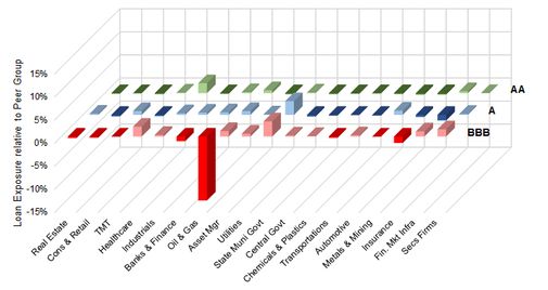
Notes: Data for illustration only. Industry categories based on schemas from typical US bank report and accounts.
Bank A has higher than average exposures to State and Municipal Governments in the A and BBB categories. They have a significantly lower than average exposure to Oil & Gas in the BBB category. They also have a significantly higher exposure to AA Industrials.
These relative exposures will be strongly influenced by Bank A’s view of credit risk in each category. Their stance on Oil & Gas, for example, may be based on a view that Oil & Gas companies are at risk of being downgraded; or that market rates in this segment do not justify the credit risk.
Bank-sourced data provides more insight into these industry views. Exhibit 2 compares the Oil & Gas credit distribution for Bank A and the Peer Group, grouped by bank-sourced Credit Benchmark Consensus (“CBC”) 21-category ratings.
Exhibit 2: Hypothetical Comparison of Bank A and Peer Group Credit Distribution; Oil & Gas Industry
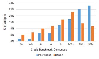
Note that it is possible for NRSRO and CBC ratings to differ; some of the obligors which are classified as Investment Grade by an NRSRO may be classified as Non-Investment Grade by banks, and vice-versa. Banks also provide estimates for a large number of obligors that are not rated by NRSROs. For this example, it is assumed that these two sources are aligned.
In this example, Bank A has skewed its credit portfolio towards the higher quality names because of its concerns about downgrade risks.
Within any of these categories, Bank A can compare its own obligor level estimates of credit risk with those of the peer group. Exhibit 3 shows an example. Note that this comparison is restricted to like-for-like comparisons.
Exhibit 3: Hypothetical Comparison between Credit Risk Estimates for Bank A and Peer Group; Single Obligors
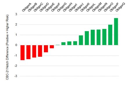
Note that this framework can be extended to show how many of the group obligors do not feature in Bank A’s book; and how many of the Bank A exposures are not quorate (i.e. Bank A may be the only bank doing business with that obligor). Note that credit comparisons can be made in whole notches, fractions of notches, or actual PD estimates. Banksourced data provides underlying average PDs, so it is possible to show notches as approximate fractions.
The green bars show that Bank A holds a conservative view on the majority of the obligors where like-for-like comparisons are available. For example, Bank A views Obligor Q, as having credit risk which differs from the Group view by more than 2 notches. Red bars indicate that Bank A is more optimistic than the group for those obligors.
This framework allows Bank A to understand the structure of its credit portfolio relative to its peers; the framework can be populated with a combination of public data and bank-sourced estimates.
This framework can be used for risk and return analysis. As with asset management, it is possible to decompose the overall yield on a loan book (net of defaults and write-downs) and attribute variations which arise due to differences in overall strategy, industry selection, credit distribution within an industry, obligor selection, or risk assessment of individual obligor risks which may affect loan pricing.
For risk assessments, banks can apply measures of credit cycle volatility, correlation between credit movements across industries, and upgrade/downgrade trends. These metrics can also be estimated from bank-sourced data, and are illustrated in the following sections.
Bank-sourced data can be used to construct a variety of benchmarks at the obligor, sector and strategic level. One practical approach is to use the CDS index methodology, where the index constituents are based on regularly updated samples (“baskets”) of obligors. This approach is detailed in a separate paper † ; Exhibit 4 shows an example.
Exhibit 4: Oil & Gas Index Baskets
Exhibit 4.1 Time Series of Oil & Gas Baskets
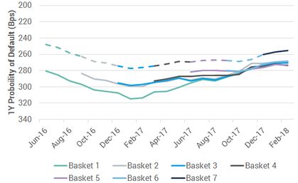
Exhibit 4.1 shows seven baskets and the published index (dashed line) over a 20 month period against an inverted PD scale. The first basket shows a slight deterioration, followed by an extended improvement and all subsequent baskets reflect these moves. It is worth noting that during the deterioration phase, the second basket is of higher credit quality; the following baskets are of similar quality as the cycle turns. During the improvement phase, the baskets again show an increasing higher level of credit quality.
In response to the decline in the credit quality, contributing banks focused on less risky obligors. They seem to have become even more cautious in recent months.
Exhibit 4.2 Oil & Gas Index “Sleeve” and Average
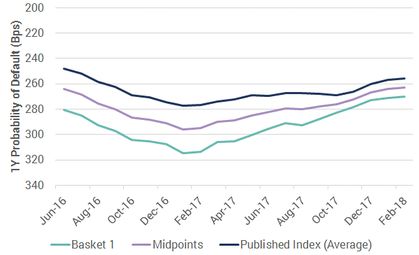
Exhibit 4.2 shows corresponding sleeve (or bands) and midpoints. The midpoints are the best representation of the level of credit quality net of selection effects; the published index shows the current level of credit quality including selection effects. The original basket shows a fixed constituent index (with some survivor bias), with the constituents fixed at the beginning of the display period but dropping out if they do not meet the eligibility criteria.
The width of the sleeve is reducing over time. The width of the sleeve indicates the scale of the credit difference between baskets. The rolling volatility of the midpoints is a proxy for the volatility of credit spreads.
Source: Credit Benchmark data
The choice of basket constituents is critical to the construction of suitable indices for benchmarking. The next section discusses this in more detail.
Ideally, any comparison of portfolio and benchmark should be based on the union set of every obligor in the portfolio and every obligor in the benchmark. This gives three subsets of obligors: common obligors, benchmark only obligors, and portfolio only obligors. However, bank-sourced data can only support obligor-level metrics if there are multiple banks contributing to the same name; so benchmarking has to be based on a hybrid of index and obligor level information. Exhibit 5 shows the various levels of information available in bank-sourced data.
Exhibit 5: Universe Subsets: Comparison of CB Universe and Contributed Client Data Sets
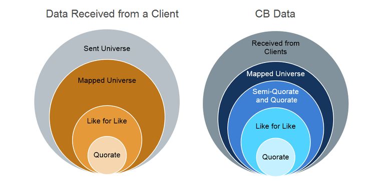
The left-hand Venn diagram shows that contributed data consists of the overall (“Sent”) universe, most of which is mapped (“Mapped”) to existing reference data such as LEIs and DUNS numbers. A subset of these names will match those sent by at least one other client (“Like for Like”) and a further subset will match those sent by at least two other banks (“Quorate”).
The right-hand Venn diagram shows that the combined bank-sourced dataset has the same structure, but the universe consists of all data received from each client, as well as an additional subset in the form of “Semi-Quorate and Quorate” – the latter consists of any obligor where credit risk data is available from more than one bank. The Semi-Quorate and Quorate subset forms CB Index.
Exhibit 6: Alternative approaches to CPM benchmarking
Exhibit 6.1 Portfolio Benchmarking
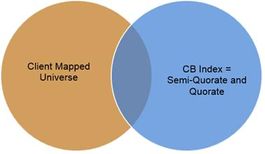
This approach compares the relevant index with the (usually large) mapped subset of the Bank A obligor universe. This has the advantage of using the largest possible samples to represent the portfolio and the benchmark, but it may be unrepresentative if the overlap between the two sets is small. This will be less of an issue if the portfolio and benchmark are decomposed into the type of categories shown in Exhibit 1.
Exhibit 6.2 Semi Quorate and Quorate Like for Like
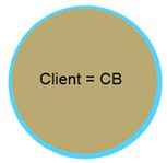
This approach compares only semi quorate and quorate obligors that are also part of the Bank A loan book. The advantage of a direct comparison has to be weighed against the disadvantage of a potentially small (and possibly unrepresentative) comparison set
Using either approach, a number of additional metrics can provide a basis for CPM decisions. Some of these are shown in the following Exhibits.
Exhibit 7: Additional CPM Metrics: Upgrades and Downgrades – Hypothetical Example
Exhibit 7.1 Sector Specific Upgrades and Downgrades – Bank A (Like for Like Universe)
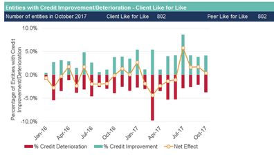
This shows the pattern of upgrades and downgrades over time in the Consumer Services sector, based on a Like for Like universe. A strong balance in favor of upgrades in the last four months is likely to push the PD lower, but the overall effect on PD will depend on the size of the changes.
Banks A had a pessimistic view on Like for Like Consumer Services in 2016 and H1 2017 downgrading more entities than upgrading in 12 out of 18 months. Upgrades dominate downgrades in the last four months.
Exhibit 7.2 Sector Specific Cumulative Upgrades and Downgrades – Bank A vs Peer Group (ex Bank A) (Like for Like Universe)
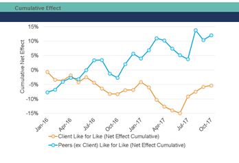
This shows the cumulative impact of upgrades and downgrades over time, with Bank A and the Peer Group shown as separate time series. The Peer Group series has had the client data removed in order to provide a controlled comparison.
Compared to Bank A, the Peer Group has had mostly optimistic view on the Like for Like Consumer Universe over the observed period. There were several periods of downturn shared by Bank A and the Peer Group including March – June 2017.
Exhibit 7.3 Sector Specific Upgrades and Downgrades –Bank A (Full Portfolio Universe)
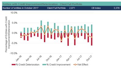
This shows the pattern of upgrades and downgrades for Bank A’s full Consumer Services portfolio. The set of obligors is larger than that of the like for like universe, so it is more representative of Bank A’s portfolio.
The Banks A’s view of the full Consumer Services portfolio was less negative in 2016 and H1 2017 with downgrades outnumbering upgrades in only 8 out of 12 months.
Exhibit 7.4 Sector Specific Cumulative Upgrades and Downgrades – Bank A vs CB Index (Full Portfolio Universe)
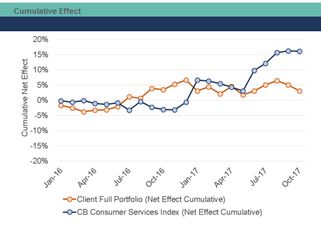
This shows the cumulative effect of upgrades and downgrades for the full Consumer Services portfolio of Bank A compared with the CB Consumer Services Index (based on all semi-quorate and quorate entities). Selection bias plays a role in this comparison as the obligors of Bank A’s portfolio differ to those in the CB Universe.
The overall trend is positive for both Bank A and CB Index but Bank A was more optimistic in 2016 and has become more cautious in the last 2 months while CB Index improved mainly in 2017.
Exhibit 8: Additional CPM Metrics: Index Time Series and Distribution Comparisons – Hypothetical Example
Exhibit 8.1 Sector Specific Index Time Series – Bank A vs Peer Group (ex Bank A) (Like for Like Universe)
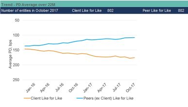
This compares the Published Index Average (seen also in Exhibit 4) for the Consumer Services Sector based on the opinions of Bank A to that of the Peer Group on the Like for Like universe. A divergence between the lines shows differing opinions between Bank A and the Peer Group for the same set of obligors.
The trends are in line with Exhibit 7.2, Bank A is rather pessimistic about the Like for Like Consumer Universe while the Peer Group shows an upward trend. The absence of the uptick in Bank A’s index at the end of the observed period means that the size of the upgrades was smaller than the size of the downgrades. The difference in levels in October 2017 indicates that Bank A is more conservative than the Peer Group.
Exhibit 8.2 Sector Specific Credit Distribution – Bank A vs Peer Group (ex Bank A) (Like for Like Universe)
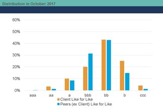
As in Exhibit 2, this shows the Credit Benchmark Consensus distribution of obligors’ credit quality level in the Like for Like Universe based on Bank A’s opinion versus the opinion of the Peer Group in October 2017. The chart confirms the conclusion on levels from Exhibit 8.1, Bank A has higher concentration of entities in categories b and c compared to the Peer Group. Interestingly, the distribution of Bank A is wider as it is well spread across all categories while the peers rate more than 70% of the entities from the Like for Like Consumer Universe as bbb and bb.
Exhibit 8.3 Sector Specific Index Time Series – Bank A vs CB Index (Full Portfolio Universe)
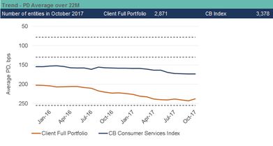
This shows the Published Index Average for the full Bank A Consumer Services portfolio in comparison to CB Consumer Services Index (based on all semi-quorate and quorate entities). Here we can compare the selection of names in the portfolio of Bank A and see how they compare to the market (represented by the CB Index).
Both of the lines show a downward trend meaning that the average credit quality of Bank A’s portfolio and CB Index is deteriorating. The difference between this chart and Exhibit 7.4 implies that the size of downgrades outstripped the more numerous upgrades. The differences in levels show that Bank A is more conservative.
Exhibit 8.4 Sector Specific Credit Distribution – Bank A vs CB Index (Full Portfolio Universe)
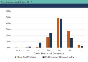
This shows the credit distribution of Bank A’s Consumer Services Portfolio compared with that of the CB Consumer Services Index across the Credit Benchmark Consensus. It indicates if Bank A’s portfolio consists of more/less risky obligors of the market (represented by CB Index) in a particular point in time.
The distributions is in line with the level difference in Exhibit 8.3, Bank A covers more b and ccc entities while CB Index is more concentrated in a and bbb.
Exhibit 9: Sector Specific Shift in Credit Distribution Driven by Selection Changes – Bank A vs CB Index (Full Portfolio Universe) – Hypothetical Example
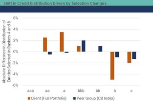
This shows the annual changes in the credit distributions of Bank A and the CB Index for the Consumer Services sector, driven by selection. The chart compares the most recent credit data on obligors covered by Bank A and the CB Index in two particular points of time (e.g. in September 2016 represented by Basket 4 and September 2017 represented by Basket 8) and indicates if Bank A or the market (represented by CB Index) has moved to entities with higher or lower credit quality. This approach eliminates the effect of credit risk trends and focuses on selection changes.
This example compare Baskets 4 and 8. Bank A chose better rated obligors for Basket 8 when compared with Basket 4, while the CB Index shifted towards bbb and bb obligors or more center intensive distribution.
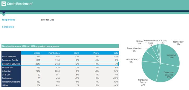
Exhibit 10: Industry Breakdown of Fixed Entities 12 Months Upgrades and Downgrades – Bank A vs Peer Group (Ex Bank A) (Like for Like Universe) – Hypothetical Example
This shows the net effect of 12 months upgrades and downgrades of fixed set of quorate entities for industry breakdown of the Like for Like universe. Column Delta shows the difference between the net effects of Bank A and the Peer Group. At a glance, one can see an overview of all sectors to gain an idea of their credit quality movements across the past year. The chart on the right shows the diversification of the Like for Like universe across the industries.
Both Bank A and the Peer Group has downgraded more Consumer Services entities from the Like for Like universe than upgraded. This analysis considers subset of entities used in Exhibits 7 and 8 with full history and the results may differ.
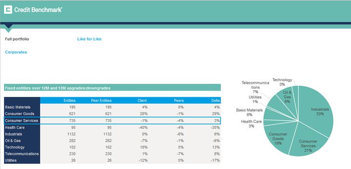
Exhibit 11: Industry Breakdown of Fixed Entities 12 Months Upgrades and Downgrades – Bank A vs CB Index (Full Portfolio Universe) – Hypothetical Example
This shows the net effect of 12 months upgrades and downgrades of fixed set of quorate entities for industry breakdown of Banks A’s full portfolio and CB Index (based on all semi-quorate and quorate entities). The views of Bank A and their portfolio selection can be compared on industry level with the market (represented by CB Index). In addition, the chart on the right shows the diversification of Bank A’s portfolio across the industries.
Bank A has upgraded more Consumer Services entities in their full portfolio than upgraded, while downgrades dominated in the market (represented by CB Index). This analysis considers subset of entities used in Exhibits 7 and 8 with full history and the results may differ.
This paper presents applications of bank-sourced benchmarks and indices in credit portfolio management. The banksourced data allow banks to compare the key elements of their portfolio to a set of peer group benchmarks, decompose the credit risk into common drivers and analyze obligor-specific risks, which leads to better-informed portfolio construction decisions.
The bank-sourced indices represent the market and can be used for setting criteria and objectives of credit portfolio management based on credit cycle volatility, correlation between credit movements across industries and upgrade/downgrade trends.
Download the article “Benchmark Risk and Portfolio Analytics” on PDF.
We aggregate the views of thousands of institutional credit analysts to create new, unique consensus data and analytics. Our clients use the unique entity- and aggregate-level data and analytics to understand and manage their risks effectively. The data helps clients focus their attention on where and when it matters most, whether in their risk management, investment process, or regulatory compliance. Learn more.
David Carruthers – Head of Research
Barbora Makova – Senior Research Analyst
* Active Credit Portfolio Management in Practice, Jeffrey R. Bohn and Roger M. Stein, 2009, Wiley
† Bank-Sourced Credit Indices, Credit Benchmark Whitepaper
Disclaimer: Credit Benchmark does not solicit any action based upon this report, which is not to be construed as an invitation to buy or sell any security or financial instrument. This report is not intended to provide personal investment advice and it does not take into account the investment objectives, financial situation and the particular needs of a particular person who may read this report.